Basketball has the unfortunate problem of difficulty of quantifying greatness. The nature of people’s games differs so much that statistically, they’re very hard to compare. We get into arguments about whether MJ was better than LeBron or if 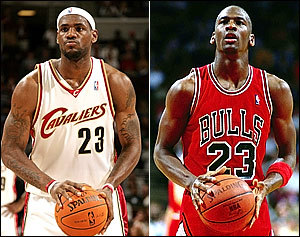 Dirk belongs in the conversation with Larry Bird because there’s no real way to quantify how much a given player means to the success of their team. Lucky for us, baseball is much more of an individual sport made up of individual battles. It’s the sum of these small battles throughout the game that determines the winners. I’m pretty sure most of you know how baseball works so I’ll spare the rest of this argument but, how do we quantify the value of hitters?
The (relatively) new field of sabermetrics has developed many stats to show us which players mean the most to their team. I’m interested to see if these stats relate to the perceived value of these players as represented by MVP voting. MVP voting is inherently subjective. So my basic question is: Do these new stats show up in the voting for the MVP over the last 7 years or, are the more traditional stats more representative of the perceived value of a given player.
To accomplish this I identified batting average, HR, and RBIs as the traditional stats and wOBA, WAR, and WPA as the new age player value statistics that should indicate the MVP of a given year (for an explanation on the some of the new age stats, go here). I looked at the top 10 players going back to 2004 in each of these stats and compared those players places in the respective stats with their place in the MVP voting. I hope you’re still with me because this is really cool stuff for you baseball nerds. Oh, more bookkeeping. If the player didn’t show up in the MVP voting, I assigned a value of 30 (because I could) and figured that into the graphs. Also, I just looked at AL stats because combining the two leagues proved more than what I wanted to do. (A correlation coefficient of 1 means they numbers are exactly the same while a coefficient of 0 means the numbers aren’t related at all.) Another major problem with my method is that pitchers get MVP votes. Why they get votes or if they deserve to be in the running for this award considering the CY Young could be a topic for another discussion.
First up, batting average leaders over the past ten years. I learned a few things doing this. #1, the same guys kept popping up. Ichiro, A-Rod, and Vlad were in the top 10 in batting all 7 years and received MVP votes in each year. Second, V-Mart and Michael Young kept showing up. I think those guys must have been pretty good over the last few years and we didn’t notice. Either that or batting average doesnt matter in real value (which sabermetricians will tell you is pretty much true) or percieved value. Which brings me to this, the average correlation coefficient over the 7 year period was .534. With a high of .927 in 2009 and a low of .309 in 2004 Take it for what it is but, on the right is a graph from 2010 of batting average (x axis) vs place in MVP voting (y axis). I will say that it looks like voters are placing more of an emphasis on batting average as the years go on. The correlation of increased dependance on the batting average statistic is .757.
Next, We’ll look at how home run totals compare with MVP standing. I’m guessing Ichiro is not showing up as much. Only six of the top ten HR hitters (8%) over the 7 years did not receive MVP votes so this indicates that perhaps home run totals mean more to MVP voting than the stats will indicate. Additional information basically concludes a coefficient of correlation of .434. This number is significantly lower than the batting average stat.
To round out the Triple Crown statistics, we’ve got runs batted in. Again, I found that almost everyone who was in the top 10 in RBIs received MVP votes (97%). Also of note, the RBI champ won the MVP only once but, finished in second three times and never finished out of the Top 10. That said our correllation between RBI ranking and MVP ranking stood at only .457 over the past 7 years. The number is probably lowered a lot by the graph on the left showing the 2010 comparison which yielded a correlation of .153.
Now we move onto the statistics designed to predict these types of things. The wOBA is largely considered one of the best metrics by which hitters should be judged while WAR and WPA provide player worth estimates.
wOBA proved a completely nonhelpful statistic in this. We had some years with negative correllation where if you did worse in wOBA, you finished better in the MVP voting. We’re talking -.09 coefficients here so its REALLY unrelated in some years. The overall  coefficient was .319 and while that reminds me of B.J. Upton’s career OBP (it’s .344 ,don’t look it up), it tells us that wOBA is a bad indicator of MVP standing despite the fact that many sabermetricians feel its the best stat to judge hitters on. It’s really very disappointing.
WAR is such a fun stat and I set out on getting my statistics with high hopes for its success. I quickly found that there was a strong relationship between really leading WAR by a few points, as A-Rod did twice, and winning the MVP. It’s not like Home Runs where if you lead the league by alot (Jose Bautista) you’re not necessarily going to win. I also saw that FanGraphs WAR metrics considers defense as Franklin Gutierrez and Alex Rios popped up as WAR leaders despite their sometimes offensive offense. With that in mind, the overall correlation of .514 leads me to believe that WAR is not the most effective means of predicting MVP possibly because of the encompassing nature of WAR, which also lends itself to debates similar to the LeBron v MJ. Or in baseball Franklin Gutierrez v Manny.
Last up, we have Win Probability Added which partially measured how a given player does in clutch situations. There’s some problems with this stat as different players are put in clutch situations because of the quality of their team…or chance. After crunching the numbers, I saw that there was only three players in the top 10 over the 7 years who didn’t get MVP votes (Jack Cust deserved votes in 2007 sorry Jack). I found a .531 coefficient of correlation this time. Realistically, the number would have been dramatically improved if Paul Konerko or Evan Longoria had produced more in the clutch in 2010.
Give me a second to explain what I just put in front of you (Above). Blue is 2010, green 2009, yellow 2008, red 2007, purple 2006, grey 2005, and light blue 2004. This gives you an idea of the emphasis that MVP voters put on a given statistic over the years. Each dot is representative of a given years’ coefficient of correlation. Those of you who take the time to read it, or understand what I’m talking about, should find it interesting. Others, there’s a few trends that basically put what I’ve talked about in the preceding paragraphs into picture form.
To conclude, I found that batting average had the highest correlation with MVP standing. I concede that my method was flawed and that dropping the lowest player and going back further would show larger trends if any exist but, I say do that on your own time. I set out to find the stat that we judge hitters on and found that batting average is the standard. It’s indicative of a player’s real value (hits mean runs, runs mean wins) and his perceived value as shown in batting average’s importance on MVP voting.
Stat of the Day: According to the 2010 data, the number of vacant U.S. homes touched 18.7-million. It is more fun to put it in context. Assuming four people per household, the U.S. currently has enough surplus housing to house the entire population of the U.K., with room left over for Israel.
-Sean Morash


